stephen mather and the national parks
at the mather homestead
Graphic Design | Exhibition Design | Production Management
Case Study
The Mather Homestead is a 1778 Revolutionary War house that was lived in by six generations of Mather descendants over 250 years. This included Stephen Mather, who was the first director of the National Park Service.
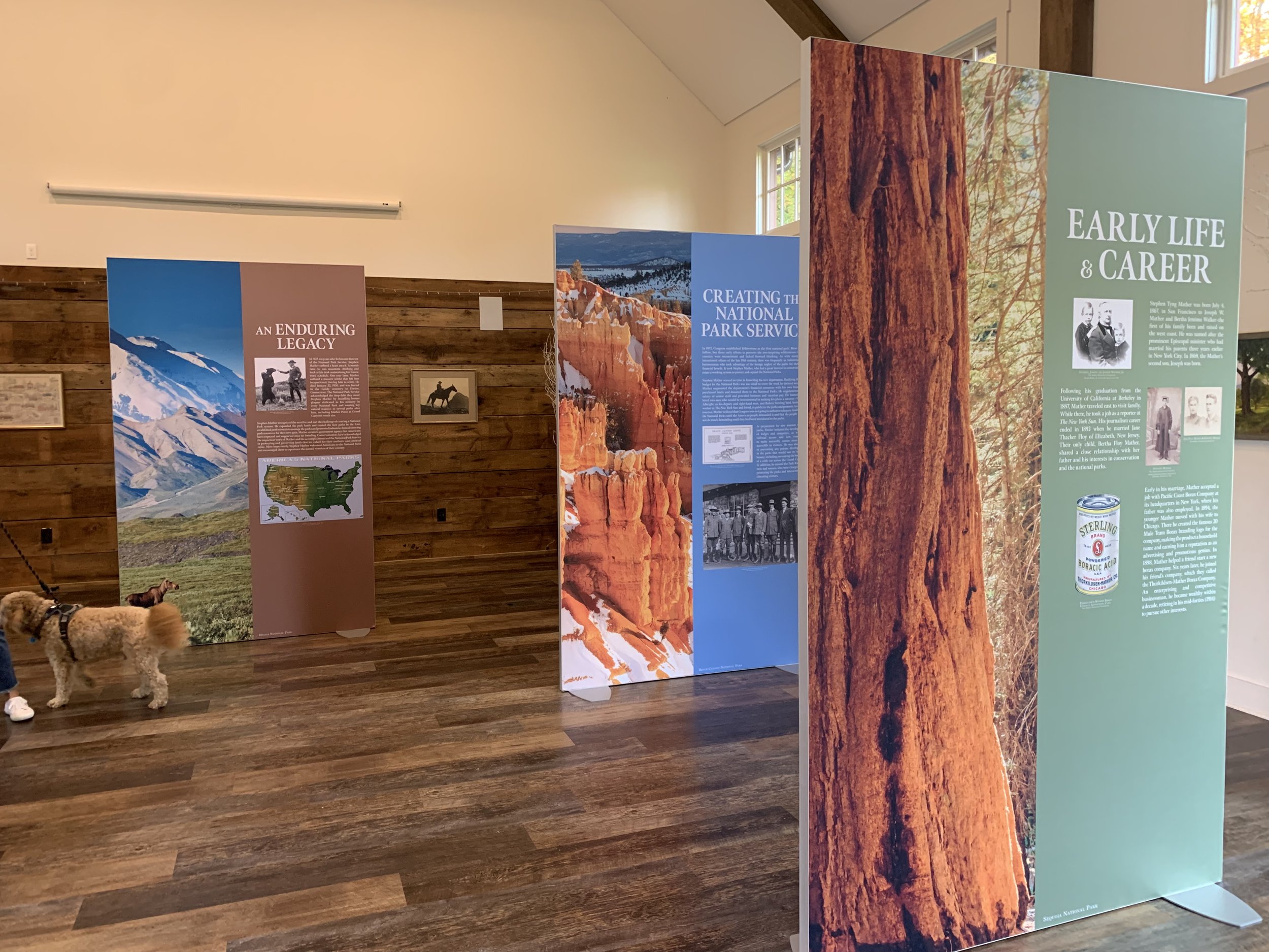
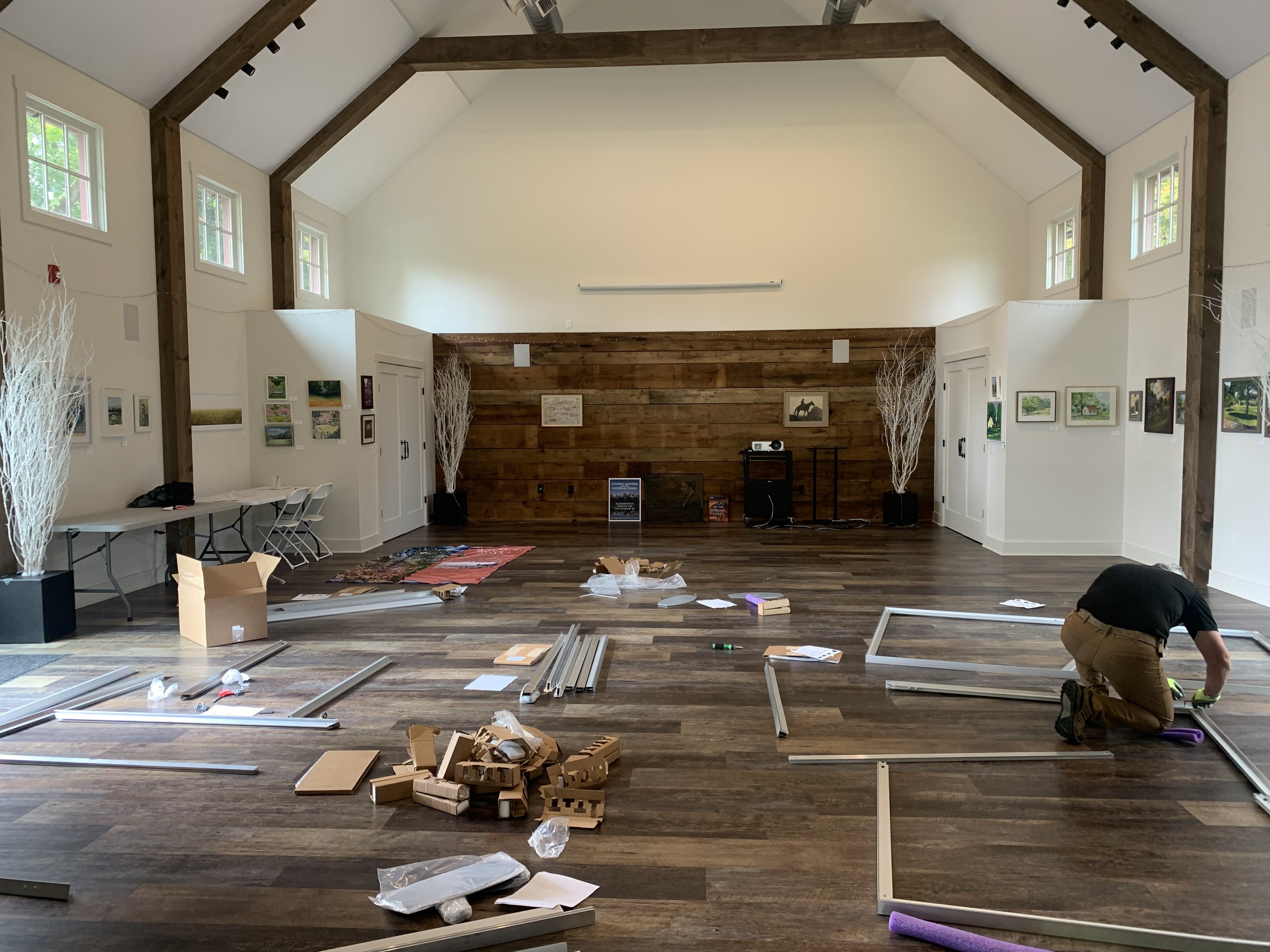
This project presented an unusual production challenge. The exhibition was to take place in a large barn that’s used for activities ranging from yoga to weddings. This meant that we needed a solution that was not fastened to the wall, could be easily moved, reconfigured, or taken down completely as necessary, but still had a “wow” factor in a space with 19’ ceilings. This sense of awe was especially important since the exhibit consisted of didactic panels with large-scale images of the National Parks. Traditional “pop-up” signs like you may have seen in hotel were out of the question since these needed to have real presence.
We worked with Quaker Chroma in NJ and decided to use Silicone Edge Graphics. These are widely used in the tradeshow and retail sphere. The graphic is printed using a process called dye-sublimation: the design is printed onto paper with special inks and then transferred to fabric with a heat press. Images and colors are especially beautiful and vibrant because the colors are embedded in the fabric, rather than printed on the surface. They can even be machine washed or dry-cleaned!
The foundation is a metal frame that can be a variety of sizes, single-or-double-sided and attached to the wall or totally freestanding. A silicone border is literally sewn into the edge of the fabric which is stretched over the metal frame by feeding it into a channel. Note, this is a relatively flexible solution but assembly takes hours, not minutes.


The brightly-colored fronts of the panels tell the story of Stephen Mather’s early life and his role in creating the NPS. The grayscale backs of the panels function more as vignettes, telling standalone stories about Mather’s life and initiatives. I chose the typeface Meno, which is an elegant contemporary font inspired by letterforms from the French Renaissance. One of Mather’s important contributions to the NPS was the fundraising for and publication of the National Parks Portfolio in 1916, a book that served as a marketing tool, encouraging visitors both as an enjoyable destination as well as an act of good citizenship. I tracked the typeface down – Ronaldson, which dates back to 1884 and has distinctive long, angled serifs. I used a modern interpretation, Fitzronald, just in historic image captions and quotes to create a subtle bridge to the past.


And, in the end, this solution suited the client perfectly. The panels have presence, but can be easily moved around for a special event.

“I loved working with Johanna on our first exhibit at the Mather Homestead: “Stephen Mather and the National Parks.” Johanna found a very creative solution to our challenge of developing an exhibit that would be large scale, filling up a 1,000 SF space, and also be easily disassembled and transported. She used design in a way we had not considered in order to create a highly impactful “wow” presentation. Finally, Johanna was easy to work with and quick to respond. I look forward to working with her again in the future!
-Heather Raker, Executive Director, Mather Homestead”